ShopDreamUp AI ArtDreamUp
Deviation Actions


Suggested Deviants


![[Commission] Castle](https://images-wixmp-ed30a86b8c4ca887773594c2.wixmp.com/f/18d54734-47e5-4707-9fb1-84d1b87d9e96/ddnxi15-fe987269-8189-4912-ad1a-ac0d4cb2baac.png/v1/crop/w_92,h_92,x_18,y_0,scl_0.085185185185185,q_70,strp/_commission__castle_by_adagiostring_ddnxi15-92s.jpg?token=eyJ0eXAiOiJKV1QiLCJhbGciOiJIUzI1NiJ9.eyJzdWIiOiJ1cm46YXBwOjdlMGQxODg5ODIyNjQzNzNhNWYwZDQxNWVhMGQyNmUwIiwiaXNzIjoidXJuOmFwcDo3ZTBkMTg4OTgyMjY0MzczYTVmMGQ0MTVlYTBkMjZlMCIsIm9iaiI6W1t7ImhlaWdodCI6Ijw9NTc2IiwicGF0aCI6IlwvZlwvMThkNTQ3MzQtNDdlNS00NzA3LTlmYjEtODRkMWI4N2Q5ZTk2XC9kZG54aTE1LWZlOTg3MjY5LTgxODktNDkxMi1hZDFhLWFjMGQ0Y2IyYmFhYy5wbmciLCJ3aWR0aCI6Ijw9MTAyNCJ9XV0sImF1ZCI6WyJ1cm46c2VydmljZTppbWFnZS5vcGVyYXRpb25zIl19.icmELRNhFj9mWMKoXKgHUGfdpiIQGinDcdcTdztSEmc)
![[Commission] Filly Autumn Blaze](https://images-wixmp-ed30a86b8c4ca887773594c2.wixmp.com/f/18d54734-47e5-4707-9fb1-84d1b87d9e96/ddkfkej-dbe952c7-de0b-4550-a2fe-8fdbb63215e4.png/v1/crop/w_92,h_92,x_0,y_0,scl_0.030666666666667,q_70,strp/_commission__filly_autumn_blaze_by_adagiostring_ddkfkej-92s.jpg?token=eyJ0eXAiOiJKV1QiLCJhbGciOiJIUzI1NiJ9.eyJzdWIiOiJ1cm46YXBwOjdlMGQxODg5ODIyNjQzNzNhNWYwZDQxNWVhMGQyNmUwIiwiaXNzIjoidXJuOmFwcDo3ZTBkMTg4OTgyMjY0MzczYTVmMGQ0MTVlYTBkMjZlMCIsIm9iaiI6W1t7ImhlaWdodCI6Ijw9MTAyNCIsInBhdGgiOiJcL2ZcLzE4ZDU0NzM0LTQ3ZTUtNDcwNy05ZmIxLTg0ZDFiODdkOWU5NlwvZGRrZmtlai1kYmU5NTJjNy1kZTBiLTQ1NTAtYTJmZS04ZmRiYjYzMjE1ZTQucG5nIiwid2lkdGgiOiI8PTEwMjQifV1dLCJhdWQiOlsidXJuOnNlcnZpY2U6aW1hZ2Uub3BlcmF0aW9ucyJdfQ.jLsT2FqQ3GMzq2caKQYSNVOmmMNuxYwBW-gK0EsHulY)
![[DailyStudy] 10 Frosty](https://images-wixmp-ed30a86b8c4ca887773594c2.wixmp.com/f/18d54734-47e5-4707-9fb1-84d1b87d9e96/dfqgqff-c977f71d-358a-490d-bb35-b2f94e7b9bbd.png/v1/crop/w_92,h_92,x_12,y_0,scl_0.10785463071512,q_70,strp/_dailystudy__10_frosty_by_adagiostring_dfqgqff-92s.jpg?token=eyJ0eXAiOiJKV1QiLCJhbGciOiJIUzI1NiJ9.eyJzdWIiOiJ1cm46YXBwOjdlMGQxODg5ODIyNjQzNzNhNWYwZDQxNWVhMGQyNmUwIiwiaXNzIjoidXJuOmFwcDo3ZTBkMTg4OTgyMjY0MzczYTVmMGQ0MTVlYTBkMjZlMCIsIm9iaiI6W1t7ImhlaWdodCI6Ijw9NjgzIiwicGF0aCI6IlwvZlwvMThkNTQ3MzQtNDdlNS00NzA3LTlmYjEtODRkMWI4N2Q5ZTk2XC9kZnFncWZmLWM5NzdmNzFkLTM1OGEtNDkwZC1iYjM1LWIyZjk0ZTdiOWJiZC5wbmciLCJ3aWR0aCI6Ijw9MTAyNCJ9XV0sImF1ZCI6WyJ1cm46c2VydmljZTppbWFnZS5vcGVyYXRpb25zIl19.kCVckxxkWAbkGu4gDJG8Yc2BhhWD_jPfwkj4eWeHM2E)


Suggested Collections


You Might Like…


Featured in Groups


Description
This is a commission for 
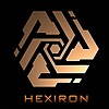
Finally, the most complicated artwork I have ever attempted in my entire life drawing. A large amount of attention was given to detail and color composition to achieve the best visuals. The two ponies there are Little Vanilla (left) and Solange (right). They are stopping for a photo shoot after riding the Kawasaki 2017 Ninja 300 (left) and Yamaha XSR 700 (right). Aren't they adorable!
The buildings at the back took quite some time to complete. There are many signs and advertisement boards on them, and one of them mentioned an artist, can you guess who?
Furthermore, here are some WIP images while this artwork was still in progress:
:origin()/pre00/4727/th/pre/i/2018/014/2/8/work_in_progress_1_by_duskie_06-dbzyzyi.png)
:origin()/pre00/c72c/th/pre/i/2018/015/7/5/commission_for_eximiusnovo_2_by_duskie_06-dc02xlr.png)
:origin()/pre00/791c/th/pre/i/2018/027/a/0/commission_for_eximiusnovo_9_by_duskie_06-dc1bfkj.png)
Feel free to click on the image to see the enlarged version.
The amount of time taken to complete this is approximately 40 to 50 hours over a course of slightly more than a month. I hope you like this! Also, thanks to all who stayed to watch my streams! <3
Program used: Photoshop CC 2015
Critiques and comments welcome!
Finally, the most complicated artwork I have ever attempted in my entire life drawing. A large amount of attention was given to detail and color composition to achieve the best visuals. The two ponies there are Little Vanilla (left) and Solange (right). They are stopping for a photo shoot after riding the Kawasaki 2017 Ninja 300 (left) and Yamaha XSR 700 (right). Aren't they adorable!
The buildings at the back took quite some time to complete. There are many signs and advertisement boards on them, and one of them mentioned an artist, can you guess who?
Furthermore, here are some WIP images while this artwork was still in progress:
Feel free to click on the image to see the enlarged version.
The amount of time taken to complete this is approximately 40 to 50 hours over a course of slightly more than a month. I hope you like this! Also, thanks to all who stayed to watch my streams! <3
Program used: Photoshop CC 2015
Critiques and comments welcome!
Image size
3000x1688px 5.91 MB
© 2018 - 2024 Duskie-06
Comments33
Join the community to add your comment. Already a deviant? Log In
Pros:
I like the details of the picture. it's full of hidden objects with tiny signs. We Germans call it "Wimmelbild" and I mean it in the very positive meaning. I like this kind of pictures, because there is so much to discover.
The picture is very well drawn and the ponies and motorbike are looking awesome and cute. The skyscapers are looking MASSIVE and they do have impact on me (yeah, I'm a country-boy from Germany, I've been in Cologne/Berlin but not in such biggies as NY or HK )
Cons:
-Lighting
Though, i don't know in Real Life if the light intensity of the city does reach the scene, I think, the albedo in the front is a little bit too high and bright. in my opinion it should have a little bit less area on the ponies and more on the bikes because *they* are more shiny.
Though, when I'm looking on the motorcycle helmets, there are at least two white-ish streetlights(?) above them, which could have illuminate the front scene while the background has city-yellow-ish lights. Well, to be honest, my imagination fails here if it would have been a good contrast and an apportionment of the image. I have just wondered about these reflections on the helmets and the missing lights...
-perspective
now, don't get me wrong here. the picture is good the way it is.
it's just that the side of the picutre is a little bit empty. I'd just scale the ponies and the bikes a bit, so that they nearly touch the images border. In this way the viewer get's the distance to the city and the ponies get a little more "attention". Well the eye is a little bit distracted from the lights and signs, so why not have a little bit rest on some (cute) ponies? <img src="e.deviantart.net/emoticons/w/w…" width="15" height="15" alt="
-sky
one small thing I've noticed: the moon is the only object in the picture without border - that feels a bit odd.
and for a little bit more contrast, I'd just go full dark with the nightsky, so the skyscrapers and the clouds get more volume.
and well - that's just my opinion, you can blend it out if you don't like that point - the small dots (i suppose aeroplanes) could have gotten a small shape.
summary
i really like your picture. "Wimmelbild"-Feeling. I don't know if you know this word, but the words meaning is something like "crawling with life" and "swarming with details". A little bit Guillermo Mordillo if you know him.
it has a bit "80s/Synthwave feeling", as it is a little bit overdrawn with the brightness and the neon signs do the rest. <img src="e.deviantart.net/emoticons/w/w…" width="15" height="15" alt="
it was good you moved the moon to the center, this balances out the brightness symmetry of the image.
And the last word of this critique are: Good work!